5 Things We’ve Learned From 10+ Years of Mobile Ad Design
How to use evergreen principles of ad creative excellence to drive growth for your mobile app portfolio.
Designing mobile creative isn’t easy. It’s part art, a lot of science, and endlessly challenging. But as challenging as it can be, there is undoubtedly a method to it.
Since smartphones first came to market, Vungle Creative Labs has been obsessed with perfecting the art of mobile ad creative. Over the years, our diverse team has developed peerless mobile advertising expertise: A treasure trove of technology, methodology, and experience that we use to deliver cutting-edge creative to our clients every day.
So if you want the formula for top-shelf mobile creative, you’re in the right place. This article reveals some of the best principles we’ve learned from designing, testing, and iterating on custom ad creative for our clients for over 10 years.
Jump to a section…
Relevance rules all
Use every pixel
Follow the 3Cs
Keep it simple
Test everything
Find a creative partner
Relevance rules all
While advertisers have always needed to create engagement quickly, the mobile environment forces them to hit the accelerator. The average user browses at a blazing pace, rarely giving themselves more than a few seconds to connect with a piece of content. In this world, everything hinges on achieving immediate relevance. Like the subject line of an email, your ad won’t get anywhere if it doesn’t grab its audience with something they care about.
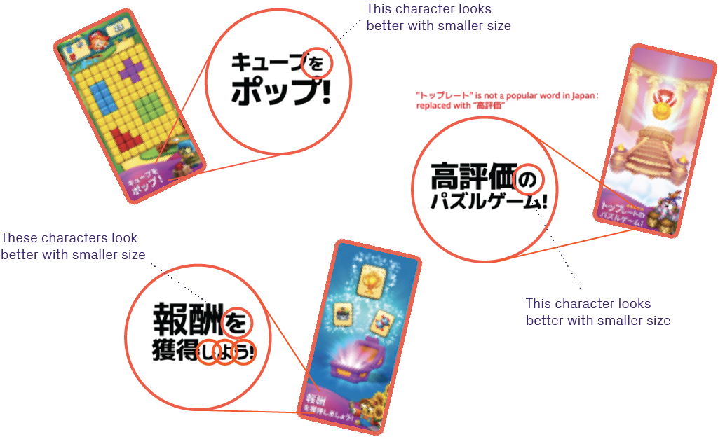
To illustrate this point, we can look at the creative we designed for Peak’s puzzle game Toon Blast. Toon Blast was a hit the U.S., and Peak wanted to help the game achieve similar success in Japan. The publisher believed a campaign that paid respect to the country’s manga artistic culture would resonate deeply with their target audience, so that was our starting point.

We decided to combine Toon Blast’s thrilling gameplay with authentic manga aesthetics in a single experience that would instantly evoke the feeling of reading a comic. The approach paid off big time, as the campaign became our top-performing creative in Japan.
This is just 1 example of how to deploy relevance to boost impact. From designing your creative around holidays to incorporating themes and terminology native to your audience, there are numerous ways to forge a connection with your ads.
Use every pixel
While ads are art with commercial intent, they are still art — and you are still telling a story. To ensure your audience fully invests in the narrative you’re crafting, use every pixel on the screen.

For an example of this principle in action, let’s analyze two ads we designed for TikTok. In the ad on the left, the app info slides into the screen repeatedly. In the creative on the right, we set the app info to hide every other loop, allowing the viewer to enjoy the story — while also delivering the brand connection when appropriate. Which ad is more effective? The latter: It maximizes the amount of screen space dedicated to telling the user a story. In other words, it uses every pixel.
When you’re developing your creative, dedicate as much of the screen’s real estate as possible to your narrative. The more you clutter the experience, the more attention slips through your fingers.
Follow the 3Cs
When we’re working on creative or messaging, we always tell clients to remember the 3Cs: compelling, concise, and clear. Why? By taking nothing for granted, the 3Cs force you to distill your product’s value proposition down to its most potent elements.

The copy of this creative we developed for Pandora is an excellent example of the 3Cs in action. The ad puts the offer front and center, making it clear that Pandora allows users to find and enjoy the music they love for free. And, lasting just a few seconds, the video wastes no time communicating its value proposition. This economy of elements is the heart of the 3Cs, and the foundation of fantastic mobile creative.
Keep it simple
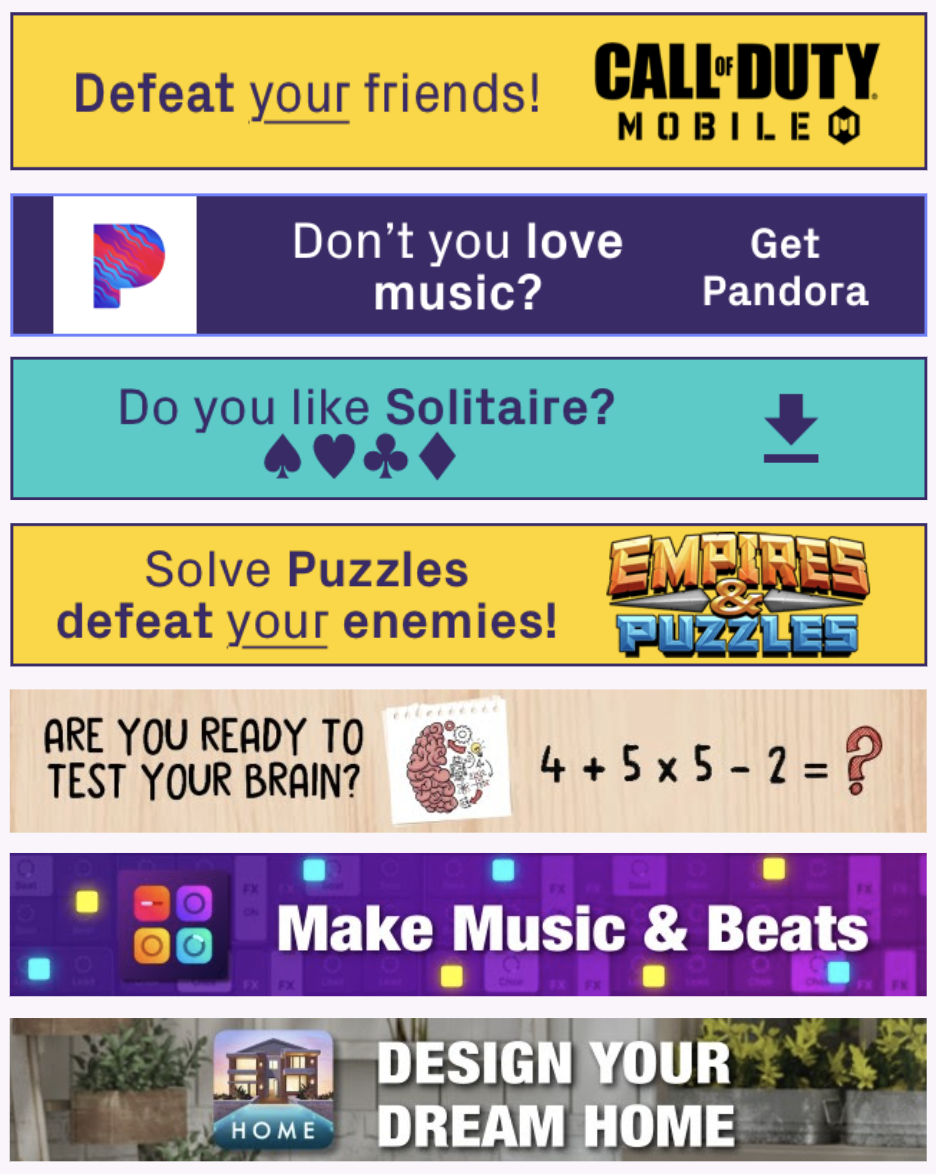
It’s only human to believe that more of a good thing makes a better thing. While that intuition may prove true in some cases, mobile advertising is not one of them. Mobile devices are not ideal platforms for a barrage of information, as a flurry of onscreen action usually only muddles the message. Nowhere is the truth of this principle more evident than with banners.

Above, we have a set of top-performing Vungle Creative Labs banners. What characteristics do they all have in common? Simplicity. When we tested our simple template banners against more elaborate designs, the minimal versions were far and away the better performers. So put a premium on minimalism with your creative. As much as you may want to blow your audience’s mind with flashy art or effects, you’ll be surprised how much that effort will lead to confusion.
Test everything
Our commitment to rigorous testing has helped us discover creative keys like the principle we just shared. What we’ve often learned is that our expectations are a much worse predictor of results than we’d like to think. After over 10 years of this process, we’ve assembled quite a collection of counterintuitive findings.
One might think that text-only banner ads would be outperformed by creative that also featured images, but the latter only edges out the former in testing. And did you know that ads that ask questions are far more likely to prompt installs than those that use a classic directive like “Get [x] now”? While “Mad Men” might want us to believe otherwise, it’s extensive testing — not just creative genius — that is the cornerstone of remarkable mobile advertising.
This is why we built Vungle Creative Labs around experimentation. Every week, our team of data scientists, creative analysts, product managers, and engineers analyze a wealth of data to design custom experiences that achieve our clients’ goals. Leveraging our global network, we evaluate ads across 24 simultaneous data points, including content and creative direction, ad placement, user interface functionality, ad duration, and file size. After each test, we integrate our findings into our engineering, product, data science, and performance optimization strategies. It’s a nonstop, intensive approach, but it also produces the best performance possible.
Find a creative partner
From the necessity of testing to the power of simplicity, those are 5 of the most important lessons we’ve learned from more than a decade of mobile creative development. If you hold to these principles, we guarantee they’ll lead to better results.
Before closing, there is 1 more piece of advice we’d like to share: Find a good creative partner. Over our years of collaborating with brands of all sizes, we’ve seen the incredible potential that’s unlocked when you combine the passion companies have for their mission with the expertise of a specialized mobile creative team.
If you’re interested in partnering with our team of multi-disciplinary experts, reach out. Vungle Creative Labs is driven by an obsession for blending creative, technology, and data insights to help our clients grow. Let us put the power of our global ad network — which covers more than one-third of the world’s smartphones — to work for you.