How ApplePay Helps Reduce Friction In Making In-App Purchases
 Last week I read a story on AppleInsider.com that ApplePay now accounts for 30% of all in-app purchases made in the Staples app, making it their number one in-app payment method on iOS. While so much of the focus on ApplePay is around the potential for it to revolutionize in-store purchases, for app publishers the news coming from Staples is the real story. ApplePay has the potential to dramatically reduce the friction involved in making purchases on mobile.
As anyone who has ever made a purchase on their phone knows – either via an app or a mobile website – the experience remains fundamentally flawed. I’m not talking about making an in-app purchase via iTunes or Google Play. Though this still requires entering a password for any non-iPhone 6 users, entering a password to make a purchase isn’t too painful of an experience.
It’s when you want to make a purchase from Costco, Target, Zappos or any other retailer with a mobile app that the mobile payment process falls apart. First name, last name, email address, city, state, zip, credit card info. It’s too much information to enter on a smartphone, regardless of screen size.
If you are lucky enough to remember your user name and password, which is rarely the case for me, you can at least login to the app or mobile site and have most of your info pre-populated, assuming you purchased from the retailer previously. But you will still need to verify your credit card expiration date and security code once you are logged in. In other words, prepare to get up from the couch, find your wallet or purse, pull out your credit card, enter your information, fix the typos you make while entering your info, then press the purchase button.
As as heavy mobile consumer and shopper, I know the experience of buying on my phone all too well. And my tolerance for even the smallest headaches as I go through the checkout process on mobile is close to zero. Admittedly, I abandon shopping carts on mobile at least 75% of the time. The experience of buying on mobile simply requires too much effort. These are mobile moments I am happy to do with out.
Now here comes ApplePay. After reading the Staples story, I was intrigued. I immediately downloaded the Staples app to see for myself what the user experience was like. And what I found blew me away.
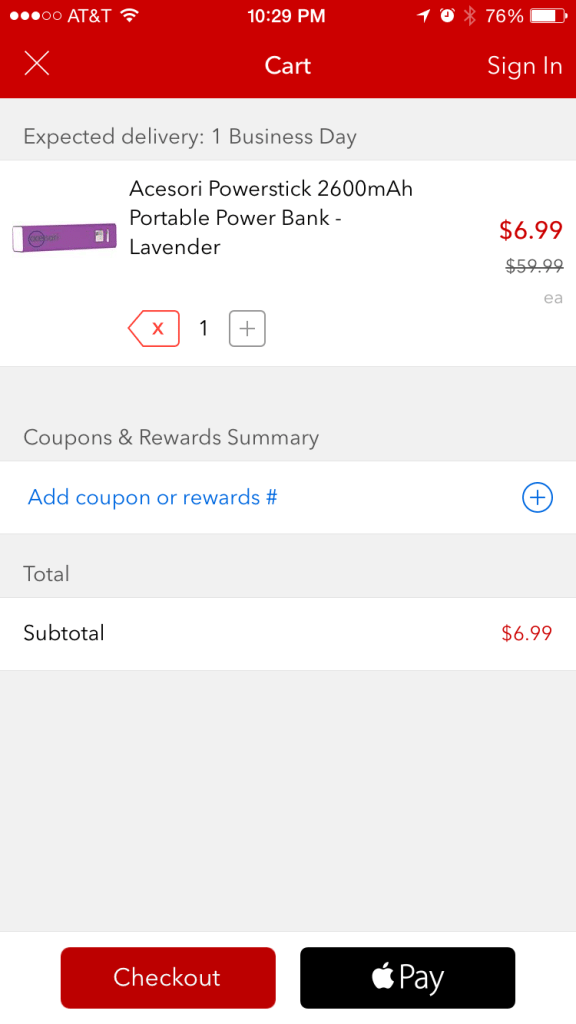
After installing and opening up the app, I went straight to Daily Deals, found a deal on a portable USB power stick and added it to my shopping cart. On my shopping cart page, I was presented with two payment buttons. One button was labeled Checkout and the other ApplePay. On the checkout page, it asked me for the usual shipping and billing information while giving me an option to login, presumably to pre-populate some of my personal information.

But when I clicked on the ApplePay button, I was presented with a screen that displayed my credit card billing information, shipping address and contact info, all pulled from ApplePay. To make a purchase, I simply needed to place my thumb on the Touch ID and voila, I’m done. No need to login, no need to get up off the couch, no need to enter data of any sort – literally ZERO. I was genuinely excited about the experience. So easy. No headaches whatsoever. A truly delightful experience.
ApplePay and, down the road, GooglePay are clearly on track to have a huge impact on how we make in-app purchases. As app publishers catch on and implement these one-touch payment solutions, I suspect we will soon start hearing more stories about about the dramatic impact these one-touch payments systems have on reducing shopping cart abandonment rates and increasing conversion rates on mobile purchases. If you’re not convinced, download the Staples app right now and try it for yourself, assuming you’ve got an iPhone 6. And prepare to be amazed.